Posts tagged with ‘web’

Social media responses on a Jekyll site using webmentions

Tags:

I’ve tried a few times to host some form of comment feed on my Jekyll site, but always ended up abandoning them. Hosted solutions such as Disqus and Facebook were too invasive for my tastes, and after trying and failing to launch my own SaaS company (Chatter.li) to solve the problem, my site has been left comment-less for a few years.
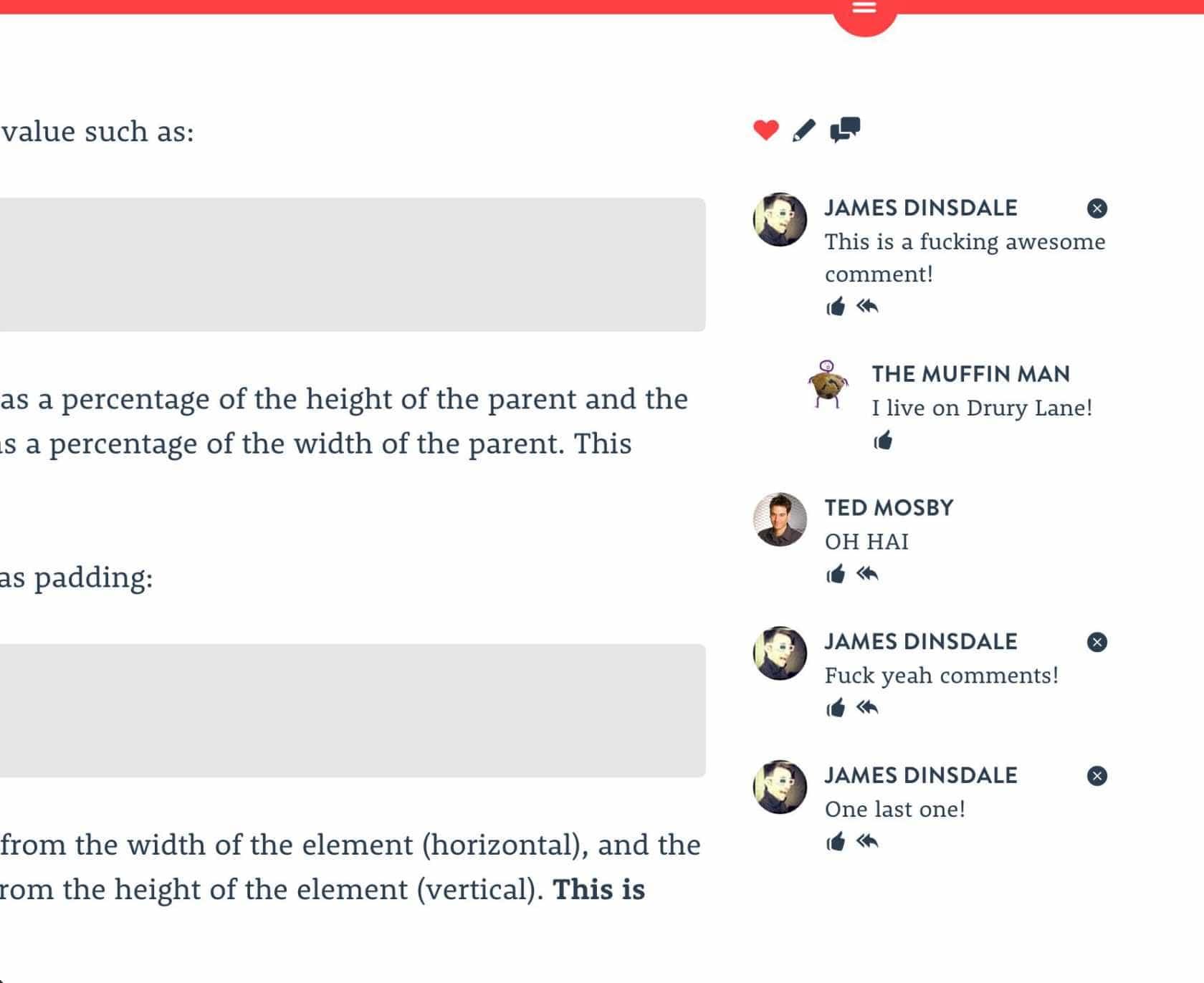
A screenshot of the commenting service Chatter, which I launched in 2013, appearing on an older version of this blog.

I recently came across the new webmention specification, and the hosted webmention API webmention.io. There were quite a few steps to get it set up, but now that it’s done and everything is automated, I am able to have posts about my site and their responses appear as webmentions on my Jekyll blog automatically. I’ll talk you through the process below.

1. Authenticate your domain

To use the webmention.io API, you’ll need to authenticate your domain. To do this, add a few rel="me" links to the <head> of your site, pointing to your various social media profiles.

<link rel="me" href="https://twitter.com/USERNAME" />
<link rel="me" href="https://github.com/USERNAME" />
<link rel="me" href="mailto:YOUR@EMAIL.COM" />

2. Sign in to webmention.io with your domain

Go to webmention.io and sign in using your domain name. This will be your username, which you’ll need later on. You’ll need to authenticate using one of the social media accounts you linked to in the previous step.

3. Install the jekyll-webmention_io plugin

This plugin performs a few different tasks for you. It adds the necessary tags to the head of your page to allow you to accept webmentions, it pulls webmentions into your site via the webmention.io API, and it sends outgoing webmentions for any outbound links in your content.

To install the plugin, first add the following to your Gemfile and run bundle install.

group :jekyll_plugins do
  gem "jekyll-webmention_io"
end

Then, add the plugin and configuration to _config.yml.

gems:
  - jekyll-webmention_io

webmentions:
  # Enter your webmention.io username
  username: your-domain-name.com
  cache_bad_uris_for: 5
  # If you've changed domain in the past, list the old ones here
  legacy_domains:
    - https://old-domain.com
    - https://another.com
  # I have the JavaScript portion of the plugin disabled, since I'm
  # triggering builds with Netlify
  js: false

Once that’s done, add the following liquid tags to your templates.

<html>
<head>
  ...
  {% webmentions_head %}
  ...
</head>
<body>
  ...
  <!-- You'll probably only want this on article pages -->
  {% webmentions page.url %}
</body>
</html>

Build and deploy your site, and you’re now ready to accept webmentions. If you want to, you can be a lot more specific with the plugin configuration. Take a look at the jekyll-webmention_io repository for more details.

4. Trigger webmentions for your social media posts

There are a few services out there for sending webmentions, and I haven’t tried them all, as I settled on Bridgy pretty quickly. The setup for each of them should be fairly similiar.

To authenticate with Bridgy, go to brid.gy and sign in with your preferred social media accounts. You’ll need to have the URL of your site listed as the website URL on your profile on each service for this step to work. Bridgy will immediately start crawling your website and social media feed, and send webmentions for each of the URLs it finds in your posts, and any posts which mention your domain.

5. Trigger site builds when mentions are received

If you head back to webmention.io, you should start seeing the mentions appearing in the dashboard. Now, if you have some mentions, on the settings tab, you can add a webhook address which will be pinged every time a mention is received. I use this to send a request to Netlify to trigger a rebuild and deploy of my site, meaning the mentions appear on my posts almost immediately.

So there you are, hopefully now you’re up and running, with responses to your posts appearing automatically. It may take a while for posts to trickle through, since social media APIs aren’t great for accessing historical content (Twitter only lets you search the last 7 days for example), but any new posts after setup should be picked up.

Thanks to Aaron Parecki for his work on building webmention.io, and to Aaron Gustafson for his work on the jekyll-webmention_io plugin. To learn more about webmentions, POSSE and owning your own content, check out IndieWeb
Getting it wrong

Tags:

I had hoped that my first blog post in two years would be about something a little sunnier than this, yet here I find myself offering my readers a heartfelt apology, and a promise to do better.

Historically, this website has always been my test bed; a place to try out new techniques and optimisations. As such it has usually been hyper-focused on performance and accessibility. Since I wrapped up work with my last freelance client and moved into an agency two years ago this website hasn’t received much love, sitting abandoned as I concentrate on other things.

That said, when I decided recently to redesign it, I pushed on with the task quickly. I dropped the case studies section of the site—trying and failing to write case studies has led to the death of no less than four redesigns—hoping that once I had the base of the site live, it might free my mind to concentrate on actually writing the content.

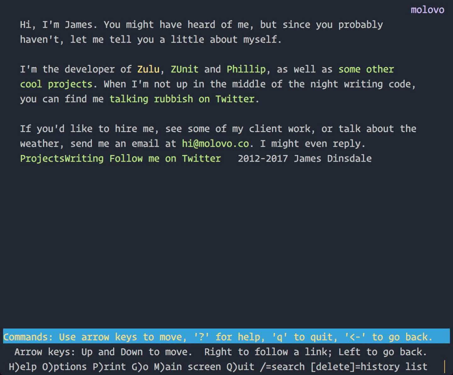
In my haste to do this, I failed to do it properly. Last week, a full two months after launching the site, I opened it up in the text-only web browser lynx on a whim, and was greeted with the following page.

The homepage of this website as viewed through a text browser, before accessibility optimisations.

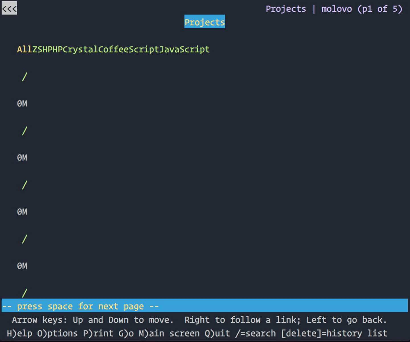
There is no obvious navigation, as it is so obscure and unreadable. There are no headings. There are no links to the location of the content or the top of the page. I was disappointed in myself to say the least, a feeling that only grew when I navigated to the Projects page.

The projects page of this website as viewed through a text browser, before accessibility optimisations.

Oh. Shit.

Immediately, I felt a wave of empathy. Empathy and guilt towards those who may have tried to browse my site with a text browser or screenreader in the time it had been like this. I have spent my career advocating accessible design on behalf of users, and yet here was obvious proof that my standards had slipped unforgivably.

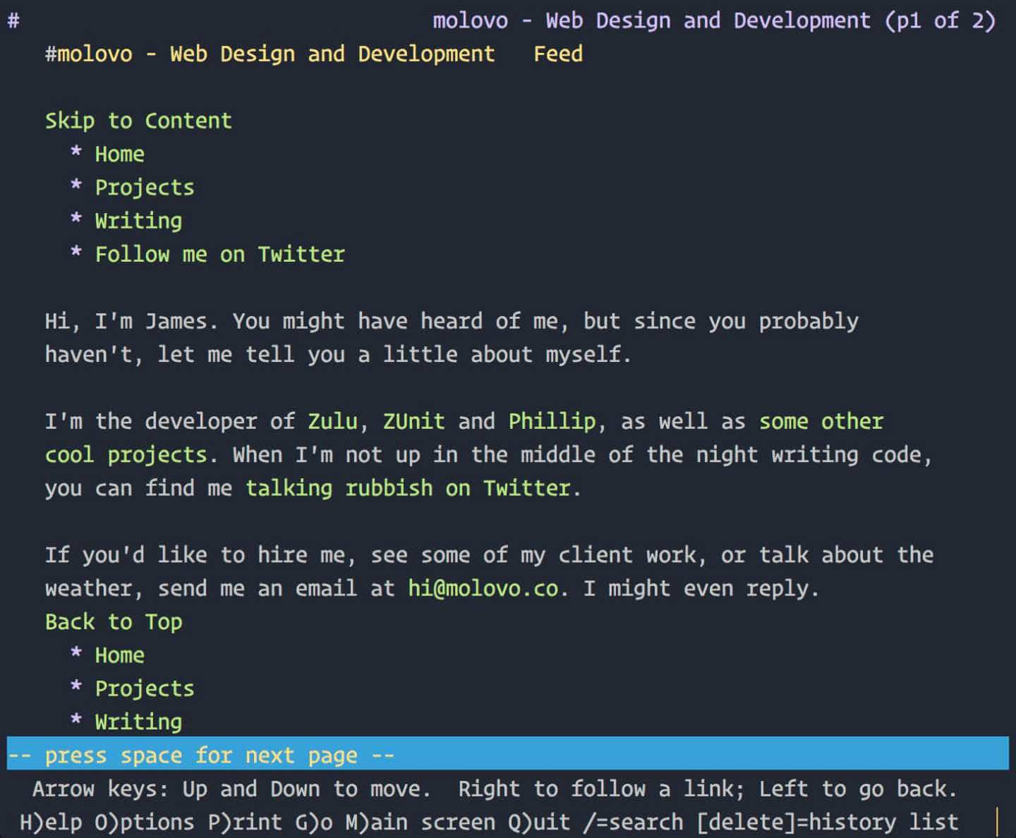
I’ve just finished rebuilding this site again—from the ground up—in an effort to right this wrong and I’m pleased to say that things are a lot better. Although it looks nearly identical, behind the scenes I’ve switched from using Roots back to my old friend Jekyll, as the accessibility aids it provides are far better. As well as this, I’ve completely restructured the HTML to ensure that it’s semantically correct, and properly annotated for screenreaders.

The homepage of this website, as viewed through a text browser at time of writing.

I’ll be tweaking further over the next few weeks as I start to add more content, but I’m a lot happier with the way things are now.


This site has been on a diet

Tags:

I’ve come a long way since I started my career. For the four years I’ve been writing it, this blog has served as a great reminder to myself of my progress as a designer and developer. That said, it has also contained—for a long time—posts which are naive, misinformative, pretentious and a bit too sweary.

Whilst I’m all for preserving the integrity of links on the internet, a lot of these past articles do not represent my current position as a designer, developer and decent human being. As such, I’ve removed those articles which I’m no longer proud of, and that is why you may be seeing this explanation instead of what you expected to see.

Please take a look at the full listing and read some of my other articles. Some of them are actually quite good.


The art of storytelling

Tags:

Users. Customers. Buyers. Shoppers. Clients. Patrons. Consumers. We use many different names to describe the people for whom we build things on the web, but we often forget that they are just that – people. People with emotions, contrasting opinions, differing reactions and distinct expectations.

People don’t get excited about websites. People aren’t excited by a fancy interface or an expensive font. People get excited about experiences.

And this is why I became a designer. I love the look on my client’s face when I present a project for the first time, and totally knock it out of the park. I love seeing a group of users excitedly exploring a new version of a product they have used for years. The more I put into this job, the more I get out of it.

Everything put on the web tells a story. The challenge is to write a story that your customers will want to tell over and over again.


Looking out for the little guy

Tags:

I am not a web designer.

I market myself as a web designer, because that’s what my clients think they want. In fact, what they want is a person who makes websites.

That’s what I am. I’m a person who makes websites. And apps too, if you’re feeling adventurous. I’m a UX designer, a UI designer, a front-end developer, a back-end developer, a hosting provider, a sysadmin, a copywriter and a marketer.

I’ve done all of the above individually, for different companies at different times, and also I’ve done all of them at the same time for a single client as part of a larger package, which I will refer to as “a website”.

Primarily, I work in front-end development. But to any client outside of “the web”, this means nothing. They don’t care about day rates, the tools I use, or the maintainability of my code; they want to give me a brief, and when the website is live, hand over a cheque for a pre-agreed amount.

There is much talk in the web community about the latest responsive trends, scalability tools and performance optimisations that should be used on the web; and much berating of those who shy away from them. This criticism is often short-sighted. Granted, the above are all important aspects in the building of a website, but they also cost money; money that the average client simply doesn’t have. But why should a lack of budget deny a client from receiving a website that employs good design principles?

The answer is in the base elements of the design; the layout and typography. Dan Donald talks about this at length in his great talk Flux and Flexibility. A well designed website could be as simple as a single column layout, with a good typographic base. Inherently responsive, a design such as this could easily catapult a small business into the modern era of web design, for very little cost.

But instead of this, too many designers concentrate on adding embellishments that add nothing more than zeroes to the price of the site. They may be eye catching, and no doubt will appeal to the client, but by placing these front and centre in mockups and prototypes, when it comes the time to remove features in order to fit a project within budget, these are the features which the client will want to keep.

But there are many aspects of web design that clients might not fully understand; responsiveness, performance optimisation, maintainability, accessibility. Why would any client choose these as features of their website, when the fancy lick of paint that masks them looks so appealing?

The answer is progressive enhancement. Not in the development sense, but in the process through which the website is designed and built. When creating mockups and agreeing quotes, start with that simple, single column layout. Explain that although such a design may not be the most modern, or the most eye catching, it is functional and inclusive across all devices, connection speeds and ability levels. Explain that embellishments cost extra, and add to a simple base, rather than removing features from an over-ambitious mockup.

If we were all to work in this way, the even the smallest of budgets could allow access to well designed, well implemented sites. Clients would not be disappointed when their users complain of lack of support for their device, or inaccessibility.

And why shouldn’t they be allowed access to good design? People laugh at clients who come to them with budgets in the range of hundreds, rather than thousands; but this is unnecessary. A website can be built in a couple of hours. It won’t win any awards, but if built properly and populated with the right content, it will be functional, and more than likely meet the clients needs.

So think about this the next time a small, local business comes to you for a quote. Spend the time to talk to them, and remember that whilst a simple website built in a couple of hours might not be up to your usual standard of work, it might just be the best thing that’s ever happened to that particular business.