Users. Customers. Buyers. Shoppers. Clients. Patrons. Consumers. We use many different names to describe the people for whom we build things on the web, but we often forget that they are just that – people. People with emotions, contrasting opinions, differing reactions and distinct expectations.
People don’t get excited about websites. People aren’t excited by a fancy interface or an expensive font. People get excited about experiences.
And this is why I became a designer. I love the look on my client’s face when I present a project for the first time, and totally knock it out of the park. I love seeing a group of users excitedly exploring a new version of a product they have used for years. The more I put into this job, the more I get out of it.
Everything put on the web tells a story. The challenge is to write a story that your customers will want to tell over and over again.
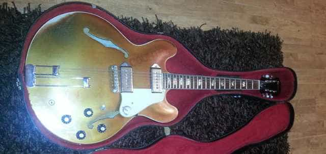
Ladies and Gentlemen, allow me to introduce you to Country Ken.
Country Ken
Country Ken is a 1967 long-scale Epiphone Casino. You might not think that he’s anything special.
The paintwork is cracked across nearly every inch of his body and neck. There is a large patch of paint missing from the corner of his body, where the player’s arm rests against it. The paint on the back of his neck has bubbled and turned black, where the sweat from 46 years of heavy playing has reacted with his nitro-cellulose finish. The original Burgundy Sparkle colour on his body has faded to a dull copper from contact with sunlight.
To many people, he looks like a piece of junk, found in some old relative’s attic; the sort of thing that would be discarded once found. In actual fact, he is the most expensive thing I have ever purchased.
So why would I spend twice the value of my car on a beaten up plank of wood? The reason is simple: because of the feeling I get from playing music on it. Any artist will tell you that it’s impossible to write or play good music without inspiration, and what better to provide inspiration than an instrument which radiates the 46 years of love, devotion and attention shown to it by those who have played it.
The Epiphone Casino was a hugely well designed instrument. It was used by the best in the business when first released, and the original guitars are a highly sought after today. It has beenimitatedcountlesstimes in the years since. But none of these modern, machine built models can possibly hope to match the care and attention that was put into building the handmade original. In comparison they feel cold, rigid and almost clinical. They lack feeling. They lack personality.
Where’s this going?
The same can usually be said about modern UI and web design. Those who design and build great user experiences allow fun, feeling and personality to shine through at every stage of the site or application’s use. Those who build cold, clinical interfaces rarely see the same levels of user engagement.
One of the best examples of this is Github. What could be an incredibly tedious user-experience – let’s face it, pushing code and fixing bugs is rarely anyone’s idea of “fun” – is made rewarding thanks to the generous use of Octocats, playful error messages, and the gamification of stats on user profiles.
With Siri, Apple managed to remove some of the stigma attached to feeling like a dick when talking to your phone by making it tell you jokes.
Google’s brilliantvideoadvertising focuses on stories and real-life events that their target market can empathise with, and introduces their product’s user interfaces almost as an additional character in the story itself. By personifying their products in this way, users immediately feel an affinity towards them.
There’s a reason that copywriting, content marketing and conversion rate optimisation have become multi-million-dollar industries. The people who do these things are (for the most part) professionals, and have spent years perfecting their craft.
With the low barrier-to-entry in web and UI design these days, far too many people are focusing on pitching their product in a cold, lifeless environment, without trying in any way to empathise with their users, and as a result, they struggle.
The cheap imitation guitars I linked to above suffer from the same issue. Instead of being built by people who love and make guitars, like the original they are attempting to imitate, they are built by people who know how to operate the machinery they are built with – two very different approaches.
So before you next start a design, spend some time with a product you love. Think about the feeling it gives you when using it. Then think about the feeling you want your users to experience, and try and implement your UI in a way that really makes them feel like they know your product, on a personal level.
That way, when you finally show the user that “Sign Up” or “Buy” button, it feels less like a sale, and more like an invitation.
There have been two exciting new products doing the rounds recently. The first is Execute, a fantastic book by Drew Wilson and Josh Long. It is about “executing on ideas immediately when inspired rather than following the normal rules”. The second is Medium. Created by Twitter founder Ev Williams, it is an online magazine, open to contributions from the public.
I only managed to pick up Execute this week. I read it cover to cover in under two hours. I really wish this book had been written 2 years ago, when I first had the idea for a website very similiar to Medium, called The Branch.
The idea was almost the same, anybody can submit articles and assign categories to them. Readers can then subscribe to a category, an author or a group of authors, and each are presented as individual collections or “magazines” within the interface. I even had plans drawn up to give a percentage of advertising revenue back to the authors.
The interface for article creation was fairly innovative, and aimed primarily at those with no knowledge of HTML, without resorting to other languages like Markdown or Textile. You can see some screenshots of the interface on Loviv (link dead).
The problem? I wasted time. I tried to build this mammoth interface all by myself, around my daily work. I completely redesigned the site three times, as having stared at it for so long I grew bored of it. I strived to create the perfect experience, and never finished, rather than concentrating on ensuring that the product shipped.
When Medium was announced publicly and went into private beta, I immediately pulled the plug. The team at Medium managed to pull off exactly the vision I was striving towards, to allow anybody to easily create articles in a beautifully typographic way. They did it with a better design, ethos and infrastructure than I did, and with the traction and publicity that Medium has gained since being announced, there was no way that my product was going to compete.
What I should have done, as suggested in the Execute book, was put aside the time to work towards the goal I had. I should have been unafraid to ask for help, rather than trying to go it alone in secret, for fear of the idea being stolen. Had I done that two years ago, I may have been able to get the site live long before Medium came into existence. Instead, I have two years of wasted evenings, with nothing to show at the end of it.
Since the day I pulled the plug, I’ve been far more focused when I come up with an idea. I actually ended up reusing the name and domain I had for The Branch for another exciting project which I built in a little under two weeks, and am now immensely proud of and enjoy maintaining.
Since reading Execute, I now know exactly where I went wrong, and will use the approaches recommended by Drew and Josh when I next come up with a great idea.
I’d recommend this book to anyone who works on projects in their spare time, it’ll save you a whole lot of headaches. Go buy it now.