Posts tagged with ‘screenreaders’

Getting it wrong

Tags:

I had hoped that my first blog post in two years would be about something a little sunnier than this, yet here I find myself offering my readers a heartfelt apology, and a promise to do better.

Historically, this website has always been my test bed; a place to try out new techniques and optimisations. As such it has usually been hyper-focused on performance and accessibility. Since I wrapped up work with my last freelance client and moved into an agency two years ago this website hasn’t received much love, sitting abandoned as I concentrate on other things.

That said, when I decided recently to redesign it, I pushed on with the task quickly. I dropped the case studies section of the site—trying and failing to write case studies has led to the death of no less than four redesigns—hoping that once I had the base of the site live, it might free my mind to concentrate on actually writing the content.

In my haste to do this, I failed to do it properly. Last week, a full two months after launching the site, I opened it up in the text-only web browser lynx on a whim, and was greeted with the following page.
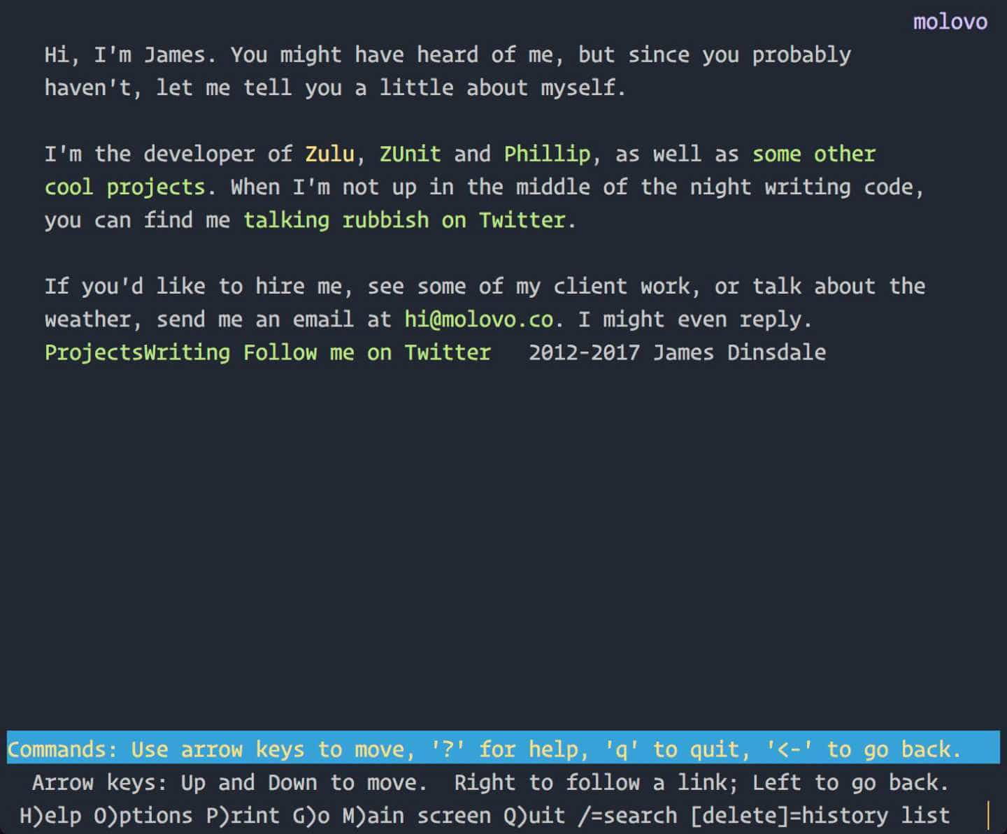
The homepage of this website as viewed through a text browser, before accessibility optimisations.

There is no obvious navigation, as it is so obscure and unreadable. There are no headings. There are no links to the location of the content or the top of the page. I was disappointed in myself to say the least, a feeling that only grew when I navigated to the Projects page.
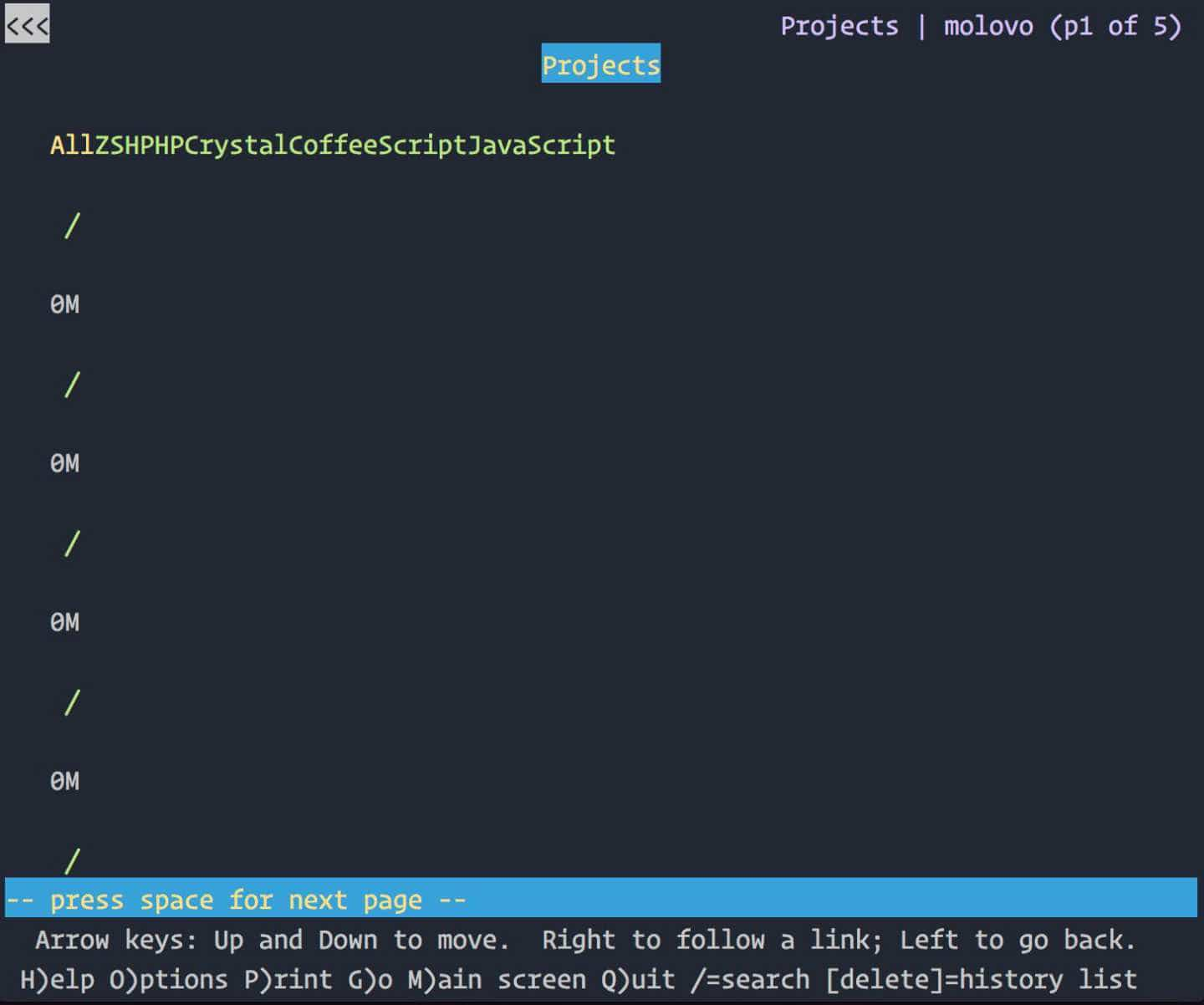
The projects page of this website as viewed through a text browser, before accessibility optimisations.

Oh. Shit.

Immediately, I felt a wave of empathy. Empathy and guilt towards those who may have tried to browse my site with a text browser or screenreader in the time it had been like this. I have spent my career advocating accessible design on behalf of users, and yet here was obvious proof that my standards had slipped unforgivably.

I’ve just finished rebuilding this site again—from the ground up—in an effort to right this wrong and I’m pleased to say that things are a lot better. Although it looks nearly identical, behind the scenes I’ve switched from using Roots back to my old friend Jekyll, as the accessibility aids it provides are far better. As well as this, I’ve completely restructured the HTML to ensure that it’s semantically correct, and properly annotated for screenreaders.
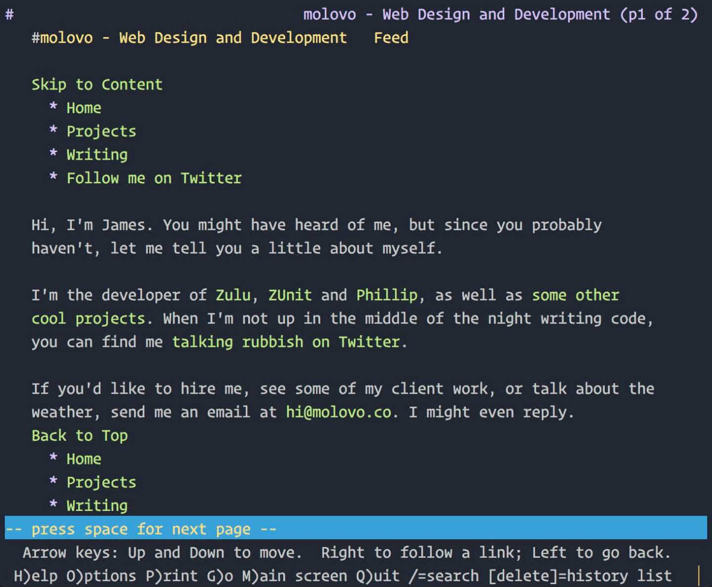
The homepage of this website, as viewed through a text browser at time of writing.

I’ll be tweaking further over the next few weeks as I start to add more content, but I’m a lot happier with the way things are now.


Screenreaders and the web

Tags:

Mention alt text to a room of web developers and you’ll likely start an argument. Should they be ignored for decorative images? Should they ever be left blank? And is anyone brave enough to say alt=" "?

Everyone has their own methods for implementing accessibility. Some are innovative, some are better than others, some are downright lazy. All however, are less than ideal, as every screenreader reads assets, code and content differently.

An alt attribute on an image is a prime example. If empty, some screenreaders will announce “Image” and nothing else. Some will announce the filename. Some will announce the title if one is present. Some will ignore the image altogether. And when included, an alt attribute is often a cop-out, an afterthought thrown in to please those who get angry about this sort of thing. Take a look at the below image:

Portrait of James Dinsdale

Those of you readers who are blessed with sight have just been treated to the pretty face of yours truly. However those users without sight simply heard “Portrait of James Dinsdale”. Where is the additional context that sighted readers enjoy? Where is the description, telling those who cannot deduce it by looking my age, race, approximate height, eye colour, hair colour, clothes, facial expression, surroundings. All these things are detected by sighted users in a matter of seconds, but for a user using a screenreader they will never be privy to this information, as alt text never goes into as much detail.

For textual content also, the mechanical, impersonal voices employed by screenreaders do little to convey the tone, emphasis and thought lovingly put into the article by the author. Where is the long pause after that poignant sentence? Where is the different voices and accents that we readers imagine when reading a written conversation? Where is the correct pronunciation when reading a name, or a word in a different language slipped into a paragraph?

In other forms of media, additional context is readily provided. Many books and magazines have audiobook counterparts for those users with poor or no sight; audible descriptions are provided for films and television programs; transcripts are provided for video and podcasts to assist the hard of hearing, but the web falls a long way behind these forms when it comes to providing a totally immersive experience for all, regardless of ability. Great steps have been made, no doubt, but more could be done.

What the web needs, is an audio attribute for images and content. The value of this attribute would be the path to an audio file, in which an image is described in detail by a real person, or an article is read aloud by the author, in exactly the context intended. Image alt attributes would still have a place, providing a short description allowing the user to then make a decision as to whether or not they would like to hear the full description. If they decide to hear more information, the audio file is downloaded and played in the background.

Yes, creating audio files for every body of text or image on a website would be a lot of work, but not every item would require it. An address, for example, does not need quite the same joie de vivre as an enthusiastic, thought-provoking article. But for important elements within a web page this would provide a much more personal experience to non-sighted users, something which is currently lacking.

If anyone knows where I can go to recommend this sort of thing be implemented into accessibility specifications I’d love to know about it.